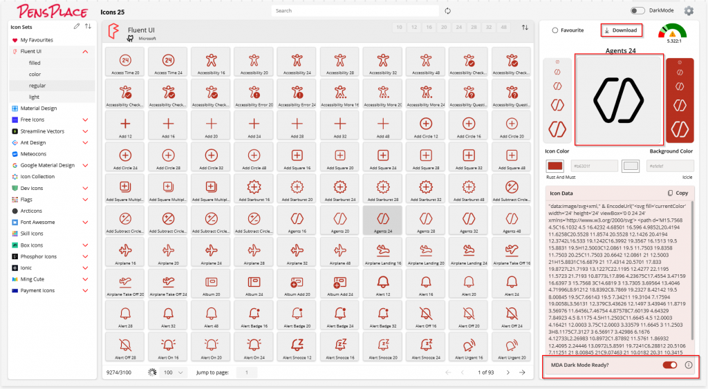
One of the most useful new features in Icons 25 is the ability to generate dark mode–ready SVG icons—perfect for use in Model-Driven Power Apps.
🌓 Why Dark Mode?
While dark mode isn’t officially supported in Model-Driven Apps by Microsoft, it’s something many developers and makers are enabling through clever use of URL parameters and custom themes. If you’re customizing your app to support dark mode, having the right icons is a crucial part of making the UI feel polished and consistent.
⚙️ What Icons 25 Does
When you select the “MDA Dark Mode Ready” option in Icons 25:
- The app automatically adds
fill="currentColor"to the<svg>tag. - It removes any hard-coded
fillcolors within the icon paths.
This allows your icon to inherit the current text color—so it will display properly whether you’re in light or dark mode, adapting seamlessly to whatever theme your app is using.
The Icons ‘icon’ in the picture below was downloaded from Icons 25 using the Dark Mode Ready option.
📥 How to Use It
- Open the icon you want in Icons 25.
- Enable the MDA Dark Mode Ready option.
- Download the icon.
- Add it to your Model-Driven App as a web resource.
- If you haven’t already, enable dark mode in your app by adding
&flags=themeOption%3Ddarkmodeto your app’s URL.
That’s it—your icon is now ready to shine in both light and dark modes ✨
📚 Learn More
If you’re new to Icons 25 or need help getting started, check out the full Getting Started Guide.
Let me know what you think of this feature or if you’d like to see support for additional theming options!

 PensPlace