
In the ever-evolving world of low-code development, Microsoft’s Power Platform stands out as a powerful suite of tools—including Power Apps, Power Automate, Power BI, and Copilot Studio Agents—that empowers organizations to build custom solutions quickly and efficiently. However, the true success of these solutions often hinges not just on functionality but on thoughtful design. Poorly designed interfaces can lead to user frustration, low adoption rates, and increased support costs, while well-designed ones promote intuitive navigation, higher productivity, and overall satisfaction.
This blog post delves into two foundational design approaches: the KISS principle (Keep It Simple, Stupid) and Gestalt design principles. We’ll explore how to apply KISS across Power Platform components to avoid unnecessary complexity, followed by a deep dive into Gestalt principles for crafting perceptually intuitive interfaces, particularly in Power Apps. By integrating these principles, developers and solution architects can create robust, user-centric applications that stand the test of time.
The KISS Principle: Simplicity as the Cornerstone of Power Platform Solutions
The KISS principle, an acronym for “Keep It Simple, Stupid,” originated from the U.S. Navy in 1960 and has since become a mantra in engineering and design. At its core, KISS advocates for simplicity in solutions, arguing that complex systems are more prone to errors, harder to maintain, and less efficient. In the context of Power Platform, where users range from citizen developers to seasoned pros, applying KISS means stripping away non-essential elements to focus on what truly matters: delivering value with minimal friction.
Why KISS Matters in Power Platform
Power Platform’s low-code nature democratizes app development, but it also introduces risks. Without careful planning, solutions can balloon into tangled webs of flows, apps, and data connections. KISS counters this by encouraging developers to prioritize straightforward designs that are easy to build, debug, and scale. Benefits include reduced development time, lower costs (e.g., fewer API calls in Power Automate), improved performance, and better user adoption. For instance, simple designs align with human cognition, reducing cognitive load and making solutions more accessible to non-technical users.
In software engineering broadly, KISS aligns with principles like “Don’t Repeat Yourself” (DRY), emphasizing reusable components over duplicated efforts. This is particularly relevant in Power Platform, where environments vary, and solutions must be deployable across dev, test, and production without headaches.
Applying KISS in Power Apps
In canvas or model-driven Power Apps, KISS manifests through clean, uncluttered interfaces. Start by defining clear user requirements and avoiding feature creep. For example, instead of overloading a screen with multiple galleries, forms, and buttons, use tabs or navigation menus to segment content. Leverage built-in modern controls—like buttons and badges—for consistency, as they come pre-optimized for performance and accessibility.
Consider a scenario: building an employee onboarding app. A KISS approach might involve a single form with essential fields (name, role, start date) and automated approvals via Power Automate, rather than a multi-page wizard with redundant validations. This not only speeds up development but also ensures users complete tasks without confusion.
KISS in Power Automate Flows
Power Automate is a prime area for KISS application, given its visual flow-based design. Complex flows with numerous branches, loops, and expressions can quickly become unmanageable, leading to higher error rates and maintenance burdens. To keep it simple:
Minimize Actions: Use fewer steps by combining operations. For instance, instead of separate actions for filtering and updating data, employ expressions within a single “Apply to each” loop.
Avoid Over-Engineering: In a case study involving Microsoft Forms data populating Word templates, a simple switch-based flow with hardcoded paths was chosen over a dynamic, loop-heavy alternative. The simple version used just 25 actions and 6 API calls, making it easier to maintain despite potential duplication, as new templates were added infrequently.
Future-Proofing with Balance: Begin with basic functionality, then optimize. Add complexity only where it simplifies long-term maintenance, such as using environment variables for configurable elements rather than hardcoding everything.
By following a structured process—starting with non-functional requirements (e.g., naming conventions), building a simple core, enhancing for efficiency, and evaluating scalability—developers can ensure flows remain lean yet effective.
KISS in Power BI and Beyond
In Power BI, KISS translates to dashboards with focused visuals: limit charts per page, use consistent colors, and avoid unnecessary slicers. For the broader Power Platform ecosystem, adopt a design system with reusable components, patterns, and guidelines to enforce simplicity across apps. This includes semantic color usage (red for errors, green for success) and modular components like custom headers to prevent reinventing the wheel.
Ultimately, KISS isn’t about dumbing down solutions but about elegance: doing more with less. As Power Platform evolves, embracing KISS ensures solutions are resilient, cost-effective, and user-friendly.
Implementing Gestalt Design Principles in Power Platform Interfaces
Moving from broad simplicity to perceptual psychology, Gestalt principles offer a framework for understanding how humans interpret visual elements. Originating in the early 20th century from German psychologists, “Gestalt” (meaning “shape” or “form”) posits that the whole is greater than the sum of its parts. In UI design, these principles guide how users group, prioritize, and make sense of interfaces subconsciously.
In Power Platform, especially Power Apps, applying Gestalt principles enhances aesthetics and usability, leading to intuitive experiences that boost adoption. Research shows that attractive designs are perceived as more usable, with first impressions forming in milliseconds. Let’s break down key Gestalt principles and their practical implementation.
Proximity: Grouping Through Closeness
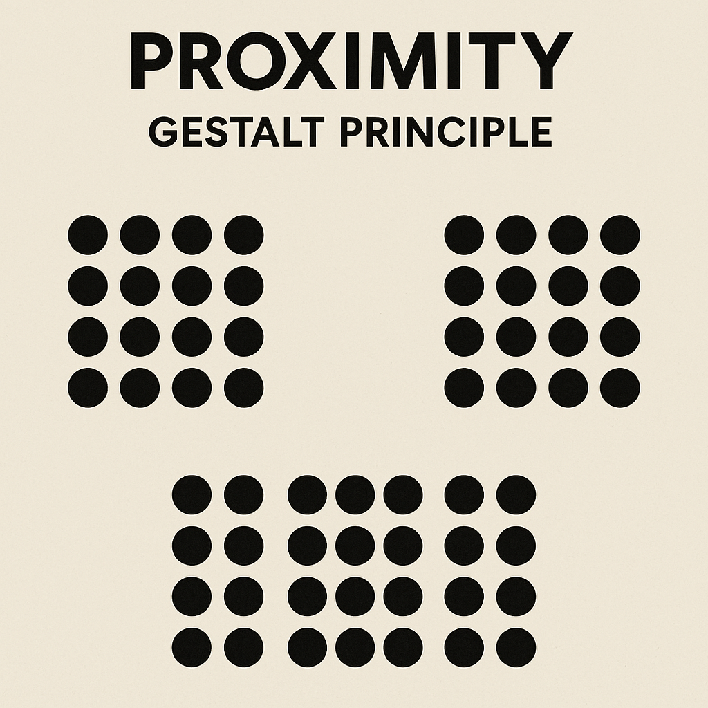
The principle of proximity states that elements close together are perceived as related, while those farther apart seem distinct. This reduces cognitive effort by leveraging natural grouping tendencies. This principle shows how elements placed close together are perceived as a group, even if they’re visually identical to others farther apart. It’s a subtle but powerful way to guide user perception, especially in UI design. If you’re thinking about applying this in Power Apps, layout containers and spacing controls are your best friends.
In Power Apps, apply proximity by clustering related form fields—e.g., grouping address components (street, city, zip) tightly, with more space separating them from unrelated sections like payment details. Use layout containers in canvas apps to control gaps, ensuring smaller spacing within groups and larger between them. For example, in a gallery of items, place action buttons (edit, delete) near each item rather than in a distant toolbar. This not only improves readability but also guides user flow, making interfaces feel organized and logical.
Similarity: Uniting Through Shared Traits
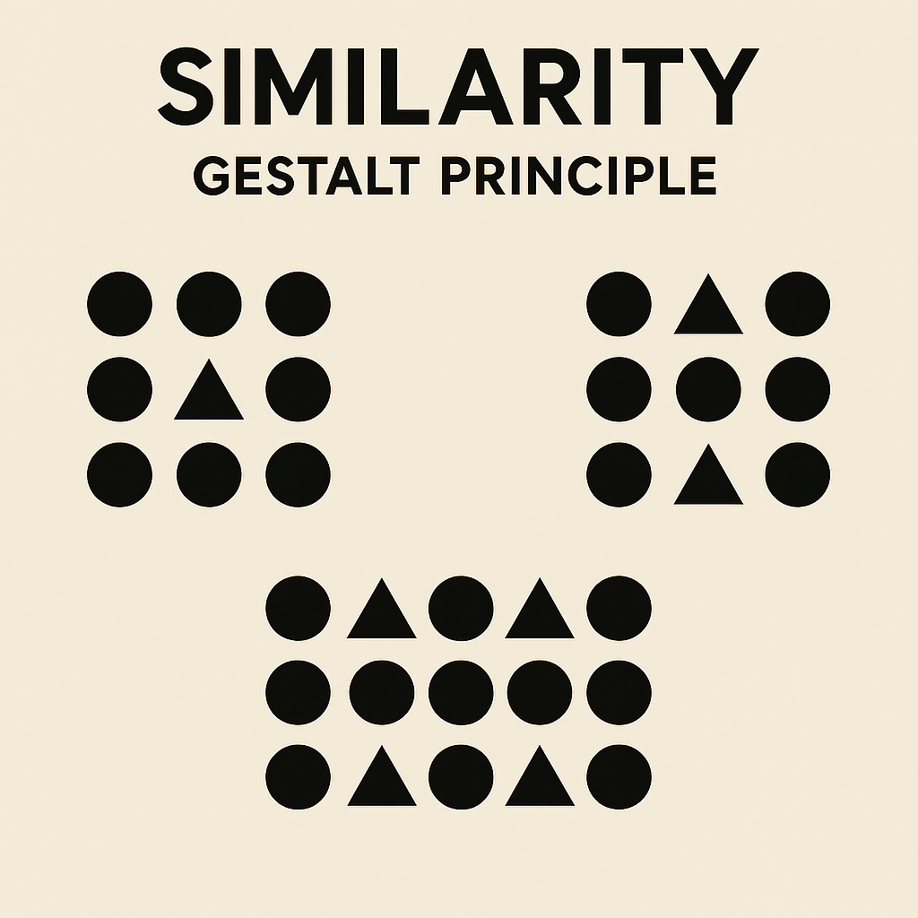
Similar elements— in color, shape, size, or style—are grouped mentally, implying shared function or category. This principle shows how elements that share visual characteristics—like shape, color, or size—are perceived as part of the same group, even if they’re spaced apart. In Power Apps, this can be a subtle but powerful way to guide users: think consistent button styles, icon sets, or status indicators that visually imply function or category.
Leverage this in Power Platform by standardizing UI elements: all primary buttons in blue with rounded corners, or icons of the same style set (e.g., Fluent UI). In Power BI reports, use consistent chart types for comparable data sets. Be cautious: mismatched similarities can confuse users, so align visual cues with actual relationships. For instance, in a model-driven app, similar-colored status badges (green for “approved,” red for “rejected”) help users quickly scan and categorize records.
Continuity: Guiding the Eye with Flow
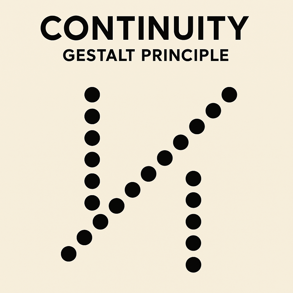
Continuity suggests that elements aligned in a line or curve are seen as connected, directing attention along a path. This principle shows how our eyes naturally follow lines, curves, or sequences, perceiving connectedness even when elements intersect or diverge. In Power Apps, this can be a subtle but powerful tool for guiding user flow—think vertically aligned form fields, breadcrumb navigation, or even animated transitions between screens.
In interfaces, use lines, arrows, or sequential layouts to imply progression. In Power Apps, align form fields vertically for a natural reading flow, or use navigation menus where items follow a logical sequence (e.g., “Home > Profile > Settings”). Animations in modern controls can enhance continuity, smoothly transitioning between states to maintain perceived connection. This principle is ideal for wizards or multi-step processes in Power Automate-integrated apps.
Closure: Completing the Incomplete
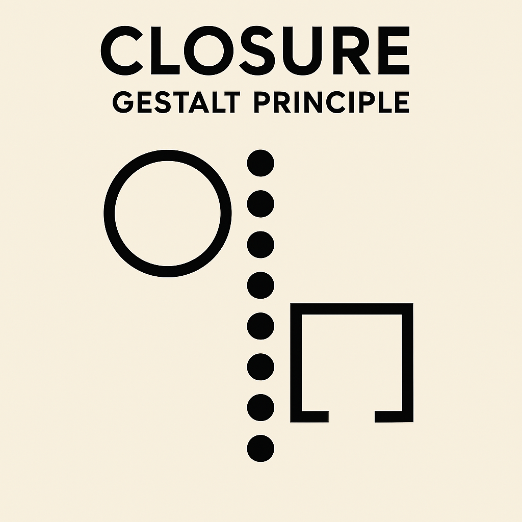
Humans fill in gaps to perceive whole shapes, even if incomplete. This principle shows how our minds tend to fill in gaps to identify a familiar shape or pattern, even when parts of it are missing or disrupted. In Power Apps, this can be a subtle but powerful way to suggest content or group elements without fully enclosing them—think dashed progress indicators, open-frame icons, or even partial outlines for image placeholders.
Apply closure with icons and minimalistic designs: a partial circle might be seen as a full button. In Power Apps, use standard icons (e.g., a magnifying glass for search) that users “complete” based on prior experience—processed 60,000 times faster than text. This keeps interfaces clean, aligning with KISS by reducing explanatory text.
Figure-Ground: Distinguishing Foreground from Background
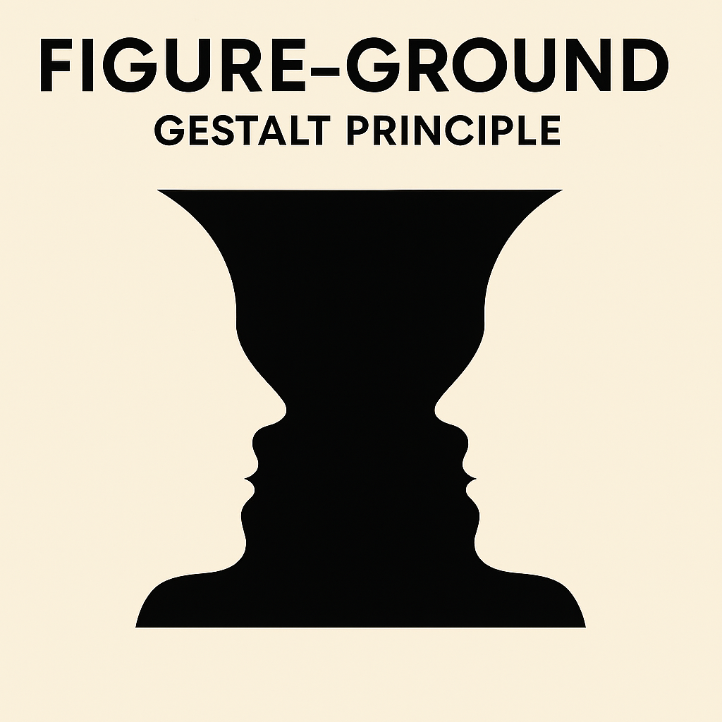
This principle separates focal elements (figure) from the backdrop (ground) using contrast. This principle reveals how we instinctively separate elements into foreground (figure) and background (ground), often using contrast or spatial cues. In Power Apps, this can be a game-changer for clarity: think high-contrast buttons, modal overlays, or layered cards that draw attention to key actions while letting secondary content recede.
In Power Platform, ensure key actions stand out with high contrast—e.g., a bright call-to-action button on a neutral background. White space acts as ground, preventing clutter. In dashboards, layer visuals so important metrics pop against subdued elements.
Common Region and Other Grouping Techniques
Enclosing elements in borders or cards creates a “common region,” reinforcing groups when proximity alone isn’t enough. In model-driven apps, use sections to box related fields. Balance with symmetry for aesthetic appeal, ensuring interfaces feel stable.
Integrating these in Power Platform involves tools like reusable components and design tokens for consistency. Test with users to validate perceptions, and combine with accessibility features like high-contrast modes.
Conclusion: Building Holistic Power Platform Solutions
By starting with KISS to streamline complexity and layering in Gestalt principles for perceptual harmony, Power Platform solutions become more than functional—they become intuitive and engaging. These approaches complement Microsoft’s Well-Architected Framework, emphasizing reliability, security, and user experience. Whether you’re a solo developer or part of a large team, adopting these principles fosters collaboration, reduces rework, and drives business value.
Remember, great design isn’t about flashy features; it’s about empathy for the user. Experiment in your next project, and watch adoption soar. If you’re diving deeper, explore Microsoft’s Fluent UI guidelines or community resources for hands-on examples.

 PensPlace